Heatmap

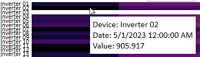
The Heatmap displays historical aggregated data at the element level (for example, inverters or wind turbines). This feature leverages GPM's Advanced Analytics to allow you to identify where and when assets in your portfolio are under-performing, allowing you to evaluate and address inefficiencies at the level of individual elements.

The default data available on the Heatmap are availablity, energy, and production ratio (PR). Each data appears as a separate Heatmap module in the Plant dashboard. You can sort the data alphabetically by element name, as well as by value, in ascending or descending order.

It is possible to customize the color-code for the percentage ranges, as well as to configure Heatmaps for other data. For more information on custom configurations, contact your GPM representative.

Figure 1. Heatmap
Layer 11234
  1. Element and data types on display.

  2. Timestamp: informs you of when the data on display was retrieved.

    Click the Refresh icon icon to refresh and load the latest available data.

  3. Display options:
    • Sorting: open the drop-down menu to select how to arrange the data on the map:
      • Alphabetical
      • Ascending (minimum to maximum values)
      • Descending (maximum to minimum values)
    • Time span: select the periods covered by the chart.
      • Month
      • Quarter
      • Year
    • Date selector: open the drop-down menu to select the dates for the time period.

  4. Element performance: hover over a cell to view a detailed information panel about the element's performance at a particular point in time:

    Information panel displaying details about the performance of the selected element